
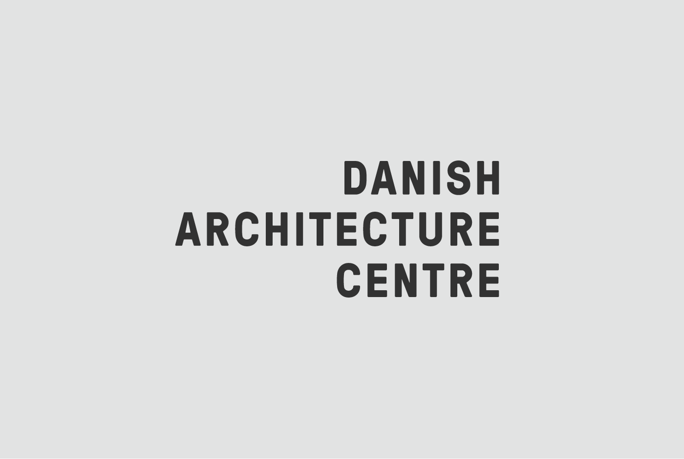
Danish Architecture Centre
overview
In 2018, the Danish Architecture Centre (DAC) relocated to an iconic new building designed by Rem Koolhaas on Copenhagen’s waterfront. This move created an opportunity to rebrand DAC as an international destination for architecture and design and the gateway to cultural exploration of the city.
my role
Brand strategy, Brand identity design, Web design, Project management
outcome
The team at Massive Change Network created a full visual identity package and the development of brand guidelines to inform the application of the brand across all audience touch points. The result was a bold and vibrant brand identity that signals to the world DAC is the welcoming gateway for exploration of Copenhagen, the Architecture City.
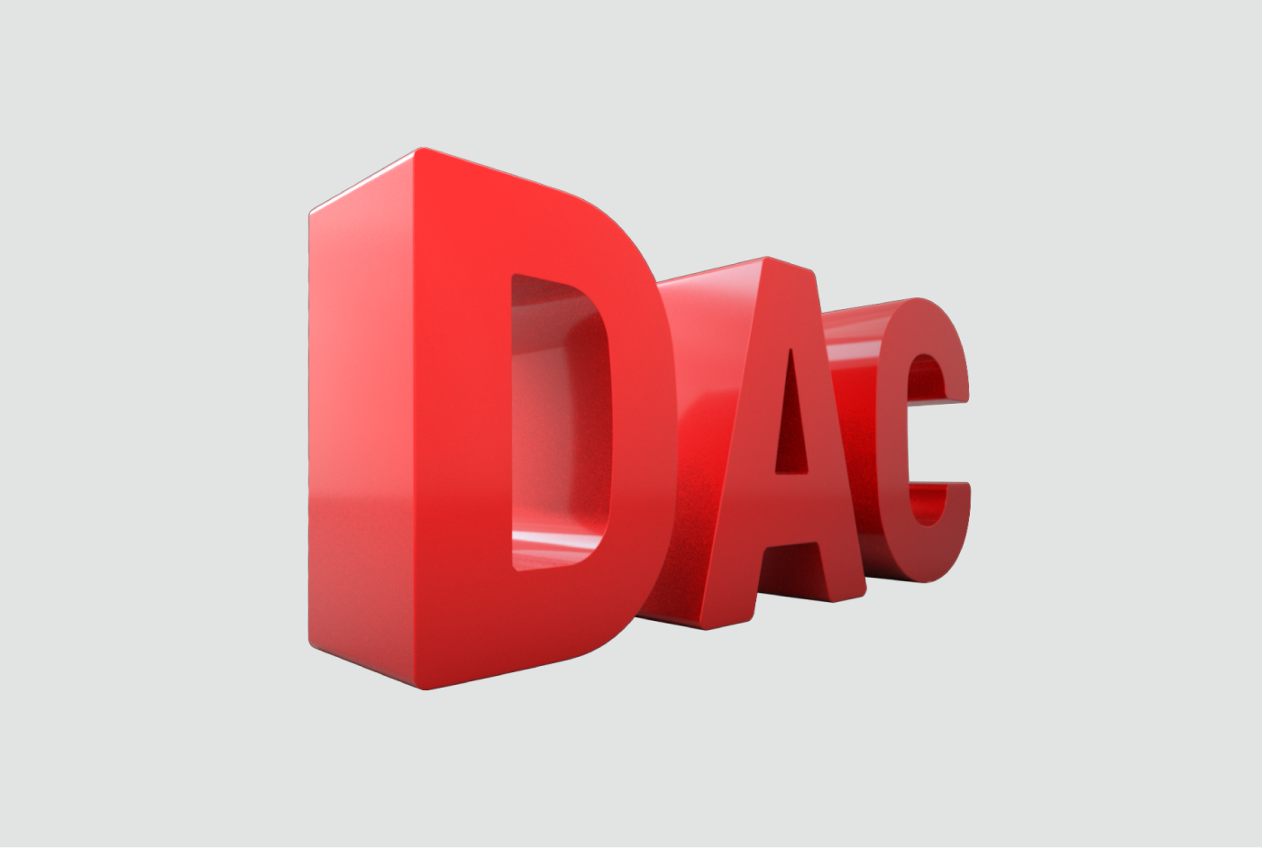
The primary DAC symbol is an architectural depiction of the name. It was designed to stand out. It has the potential to evolve over time—always new, always inviting, always open.


Red is a color that had built up alot of equity in the previous brand identity and was a client request to keep in a prominent role for the rebrand. We were able to pair the red with a dynamic gradient system that kept the equity intact while adding a new energy to the DAC brand.


A secondary typographic treatment captures the values and culture of DAC: ever questioning, open and with a touch of liberating, creative chaos. Used in motion formats, the DAC letters break apart and float across city landscapes to take audiences on virtual tours of the city.


Project created with the team at Massive Change Network.